I consult on the parts of a product that are hard to make simple. Most of my work has been in compliance, enterprise search and machine-learning tooling: places where the data is dense, the consequences of a wrong answer are real, and the person using the software is an expert with no patience for a tool that gets in the way. I started as a front-end engineer, which still shapes how I work. What follows is six projects and the reasoning behind them. If you are here to work out whether I can help with something specific, the engagements page is the shorter route.
How I work
-
Product definition. Defining the thing and its requirements. Analysing what has been asked for, consulting on feasibility, assessing timeframes and resources before anyone commits.
-
Research. Product, context, market, target users and existing competition. Support tickets and sales feedback where direct user access is limited, which in enterprise it usually is.
-
Analysis and persona building. Turning that into something a team can design against: personas, user stories, empathy maps, storyboards.
-
Ideation. Workflows and low-fidelity wireframes, fast and rough, so the argument happens early and cheaply.
-
Prototyping. High-fidelity design and a working prototype where the interaction is the point rather than the layout.
-
Testing. With whoever I can reach: niche user groups, focus groups of existing clients and subject-matter experts, usability sessions.
I have also defined how design fits into the development lifecycle: a two-stage process taking client and market requirements through brainstorming and focus-group feedback to locked wireframes and epics, then into design stories with signed-off mockups. It was adopted across product teams at Micro Focus.
01
Turning a filter form into a search language
Rebuilding enterprise search for compliance reviewers around a single intelligent input rather than a page of form fields.
Context
Enterprise Archive is a communications compliance platform. Regulated firms, banks, brokers and insurers, are legally required to capture every business message their staff send across email, Bloomberg, instant messaging, social and mobile, retain it for years, and produce any of it on demand for a regulator or a court.
Search is not a convenience feature in a product like this. It is the product. If a compliance officer cannot find a message, the firm cannot answer the regulator.
The problem
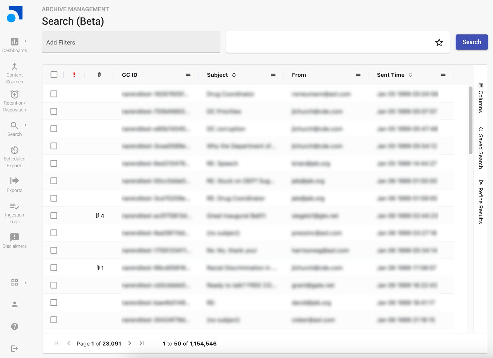
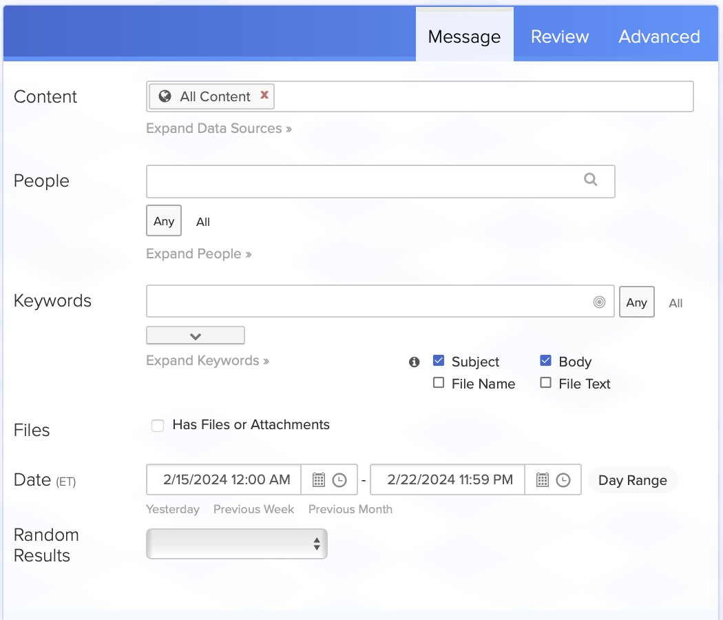
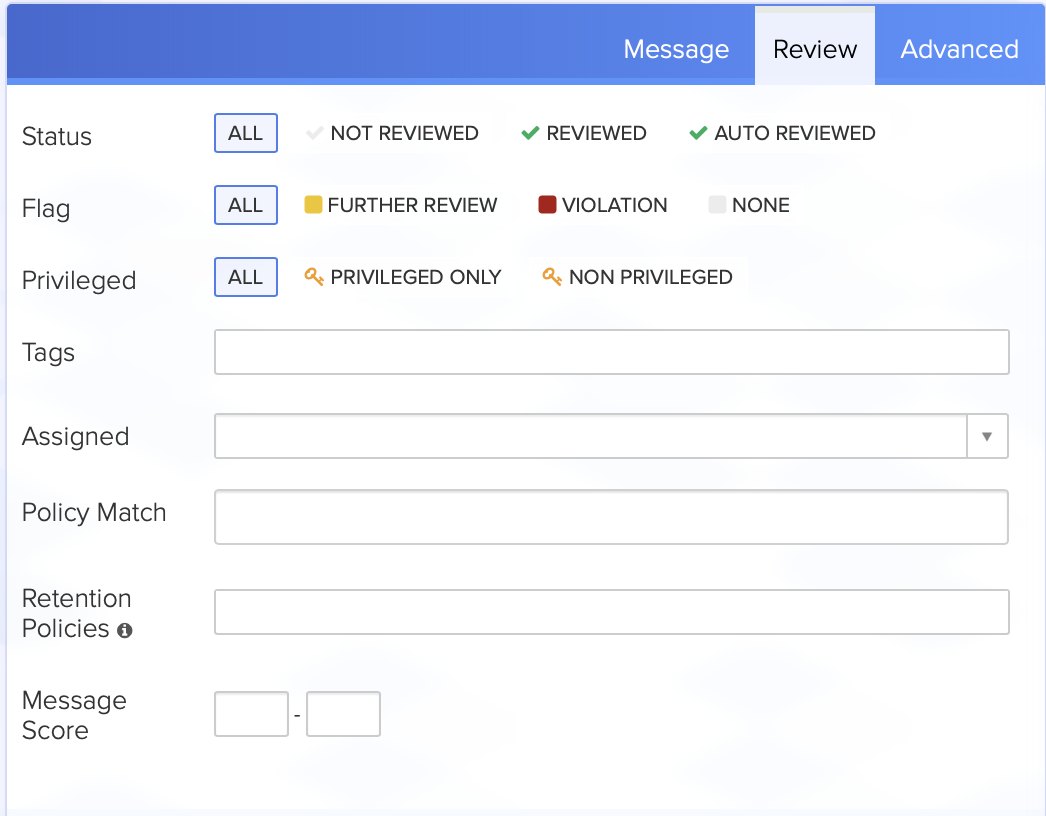
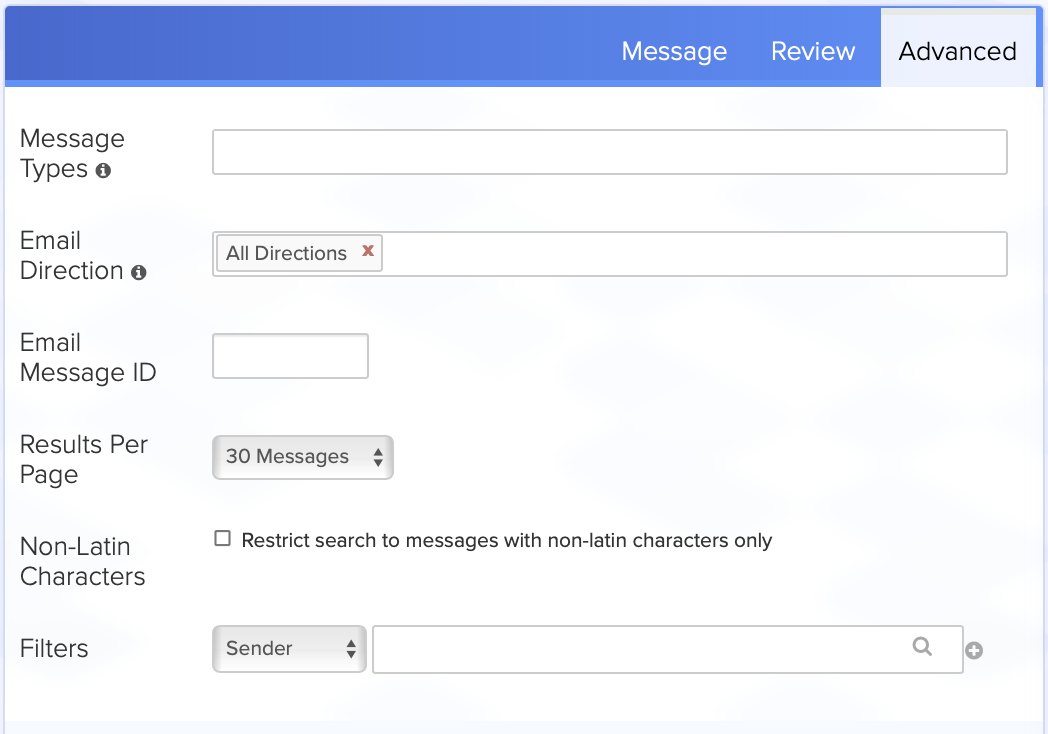
The existing search was a long, sectioned form. Content, people, keywords, files, dates, review state, permissions, each in its own expandable panel with its own controls. It was complete and it was correct, and it was exhausting.
- Slow to express a simple idea. Finding PDFs over 5MB sent by one person last quarter meant opening four separate panels.
- It made people learn the form, not the domain. Knowing what you wanted was not enough. You had to know which panel it lived in.
- It punished exploration. Adjusting a search meant scrolling back up to find the control you had already set.
Constraints
- An established design system. The Integrated Design System, built on Angular, with Jakob's Law as an explicit principle: users should feel familiar. A radical departure was off the table by policy, not just by preference.
- Existing users with existing habits. Compliance reviewers run the same searches every week. Anything that broke muscle memory would cost more than it gained.
- Regulatory exactness. A search that quietly returns slightly the wrong set is worse than one that is slow. Ambiguity had to resolve visibly, never silently.
Approach
The insight I worked from was that people already knew how to describe what they wanted. They just had no way to say it. So rather than reorganising the form, I replaced its front door with an input that accepts description and resolves it into structured filters.
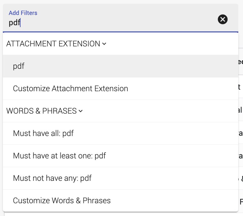
Everything typed is always offered as a plain word or phrase search. That was the safety net: no input is ever rejected, and the simplest interpretation is always available. On top of that, the input recognises patterns and offers the structured filter that matches.
Key decisions
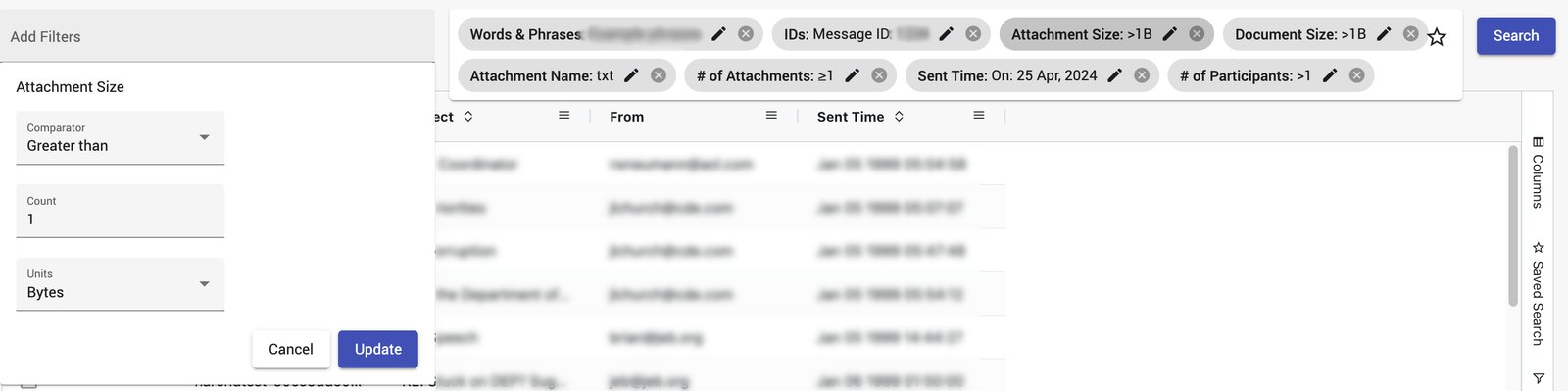
- Suggest, never assume. Typing ">5MB" does not silently apply a size filter. It offers one, and the user confirms. In a compliance tool, a filter the user did not knowingly apply is a defect.
- Parse the shorthand people already use. Comparison operators with units for document and attachment size. A number plus "participants" for participant and attachment counts. A file extension for attachment type. These are not invented syntaxes. They are how people already describe files.
- Applied filters as editable chips. A chip bag beside the input keeps the whole query visible at once, which the old form never managed. Chips with options are editable in place; chips without options deliberately are not, so the affordance means something.
- Separate refining from re-filtering. Refinement facets narrow the current result set while leaving the filters intact. Reviewers explore in passes, and forcing them to rebuild a query to look at a subset was the most wasteful thing about the old flow.
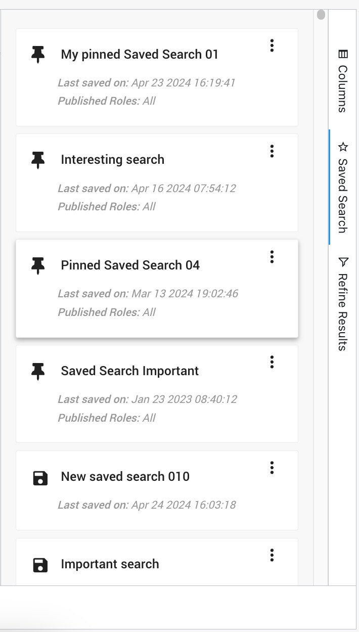
- Saved searches, pinnable. The same searches run every week. Pinning turns a repeated five-minute task into one click.
The decision I would defend hardest. Suggesting rather than applying looks like a small interaction detail. It is the whole safety model. If the system decides that ">5MB" means attachment size and the user meant it as text, they get a subtly wrong result set and no reason to doubt it. In this domain a wrong answer delivered confidently is worse than a slow one.
Outcome
The work shipped as a beta, available under Archive Management where enabled.
Screens shown are design mockups populated with placeholder data. No customer data, proprietary assets or confidential documentation are reproduced.
02
Designing for people who tune machine-learning models
An analytics interface for comparing model versions against each other on real communications data. Precision and recall as an interface problem.
Context
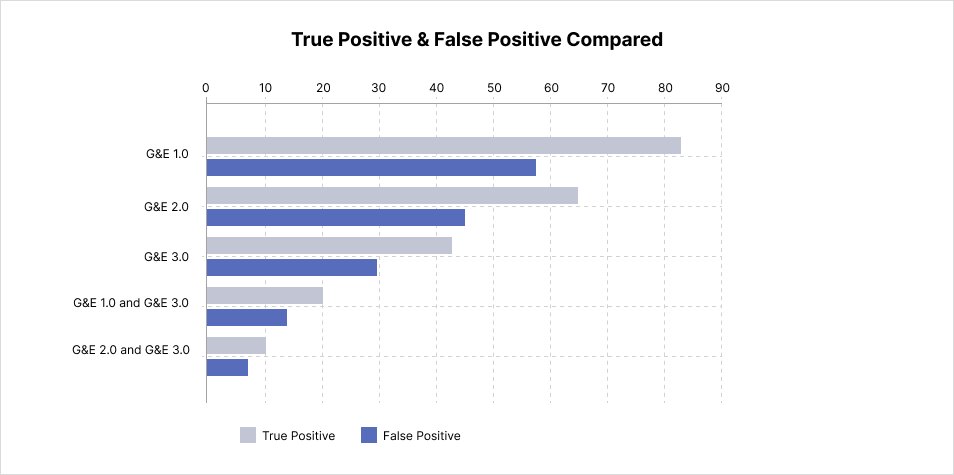
Compliance platforms use machine-learning classifiers to flag communications that may breach policy: market abuse, harassment, gifts and entertainment. Every classifier makes two kinds of mistake. A false negative means a real breach goes unseen. A false positive means a reviewer wastes time on a clean message, and enough of them means reviewers stop trusting the system altogether.
The people tuning these models needed to see, concretely, what a change to a model actually did.
The problem
Model quality is usually reported as summary metrics. Summary metrics tell you a model got better on average. They do not tell you what it now gets wrong. Someone deciding whether to deploy a version needs to see the individual messages where versions disagree, and to see several versions at once, because tuning is iterative and the question is always "compared to what".
Constraints
- Genuinely high information density. Every message needs an alerted state and a classification outcome, per evaluation, across several evaluations. There is no version of this that is not a wide table.
- Consequence asymmetry. A false negative and a false positive are not equally bad, and the interface should not present them as visually equivalent.
- The same design system as the rest of the suite, despite this being a fundamentally different kind of tool from the archive modules.
Key decisions
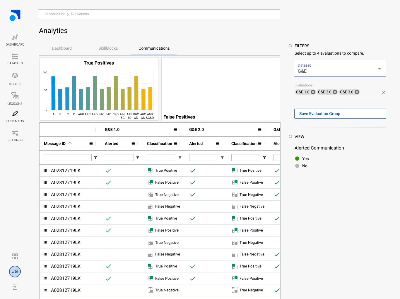
- Cap the comparison at four. Enough to see a trend across iterations, few enough that each column stays readable. An arbitrary-width comparison would have been easier to build and useless to read.
- Chart the summary, table the detail. True and false positives charted across model variants and their combinations for the shape of the thing; the full per-message table underneath for the evidence. The chart answers "is this better", the table answers "how".
- Classification as a distinct visual language. True and false, positive and negative, each with its own mark rather than colour alone. The distinction is the entire point of the screen, and colour alone is both ambiguous and inaccessible.
- Alerted state separated from classification. Whether the system raised an alert and whether the alert was correct are two different facts. Conflating them hides exactly the disagreements the user is hunting for.
- Saveable evaluation groups. Model tuning is repetitive. The same comparison gets rerun after every change, so the comparison itself is worth persisting.
- Per-column filtering on a wide table, so a user can isolate one disagreement class: every message where version 1.0 was right and 2.0 was wrong.
Outcome
The comparison model is what this work settled: four versions at a time, classification carried by a mark rather than a colour, and alerted state kept separate from whether the alert was right. Those are the decisions the screen is built on.
I left Smarsh in September 2024, so I can speak to the design and the reasoning behind it rather than to long-run adoption.
Screens shown are design mockups populated with placeholder data. No customer data, proprietary assets or confidential documentation are reproduced.
03
Making a phone call legible
Speech², a speech-analytics platform for contact centres: search across transcripts, sentiment plotted along the waveform, and real-time assistance while the call is still happening.
Context
Contact centres record everything and can review almost none of it. A supervisor with a thousand calls a day and time to listen to six is choosing at random. Speech analytics exists to make that pile searchable: transcribe the audio, detect entities and sentiment, and let a human go to the moments that matter.
What I designed
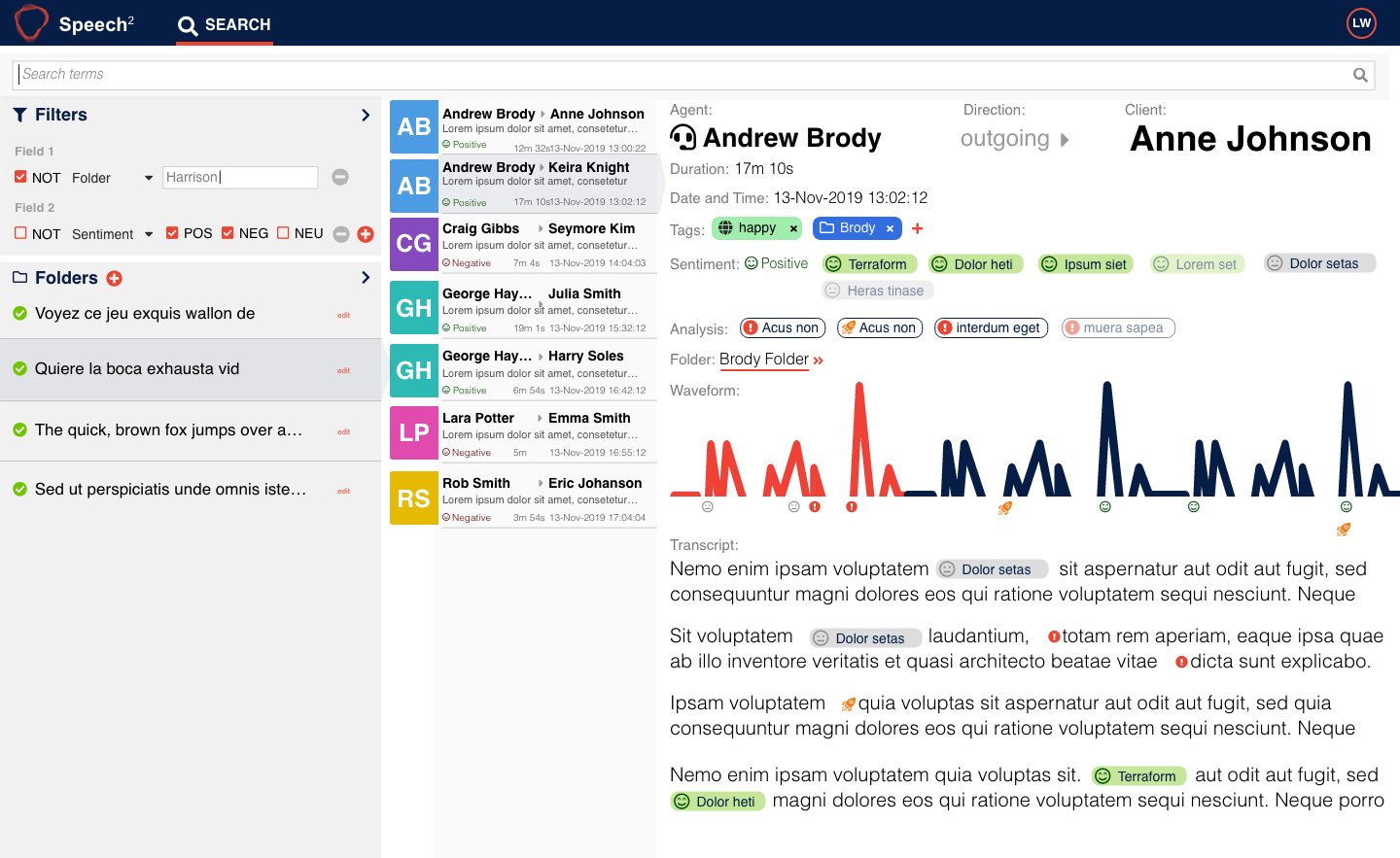
- Call search. A filter builder supporting negation and sentiment logic, folders, and a results list showing agent, client, duration, date and call sentiment at a glance.
- The call view. Transcript with inline entity tags, an audio waveform with sentiment and event markers plotted along it, tags, analysis chips and folder assignment. The waveform doubles as navigation: the shape of the call tells you where to listen.
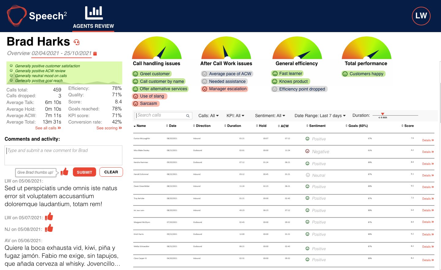
- Agent review dashboards. Gauges for call handling, after-call work, general efficiency and total performance; behavioural markers such as greeting the customer, offering alternatives, use of slang, sarcasm; a per-call table with sentiment, goals and score, and a comments feed for coaching.
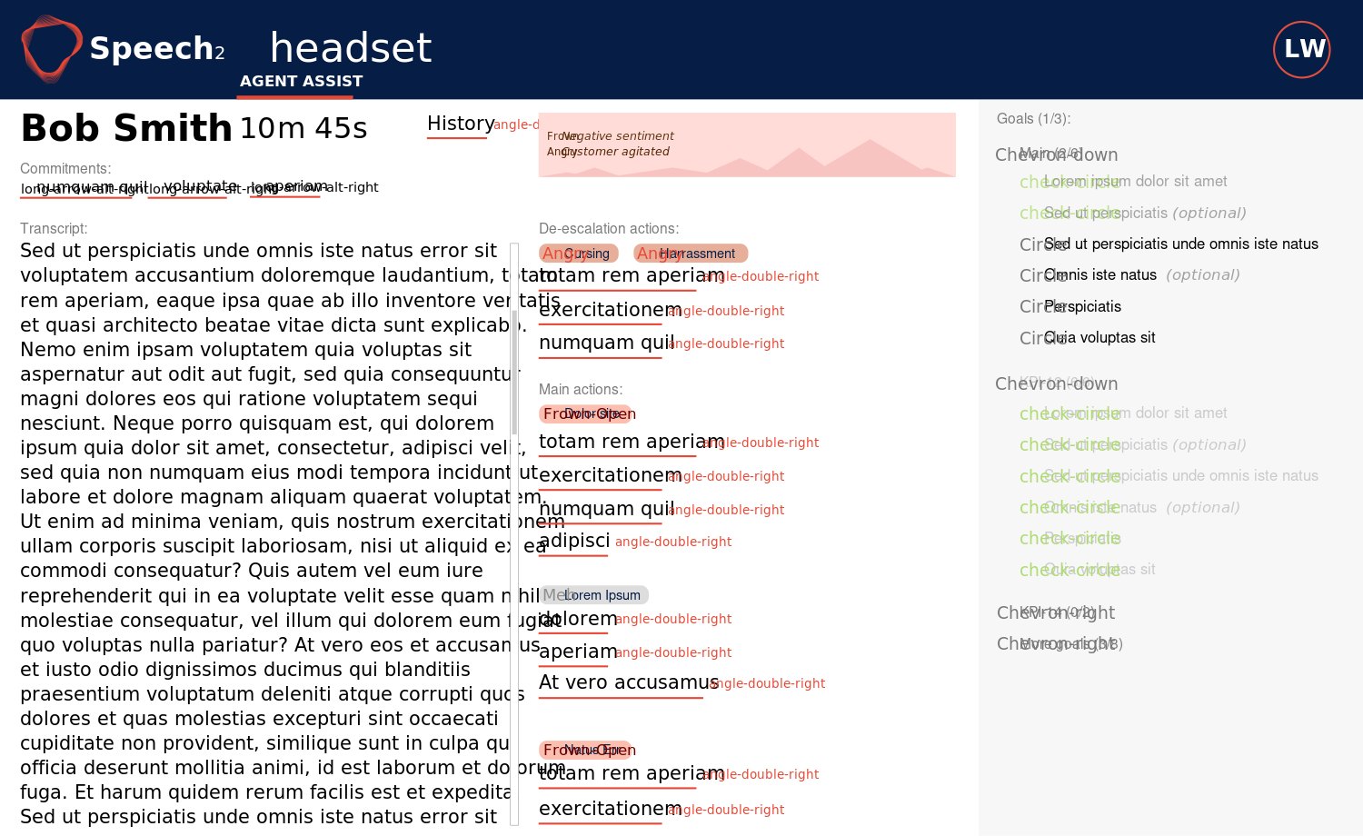
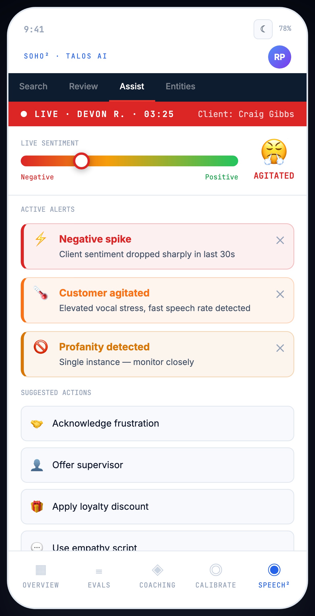
- Agent Assist. Live, during the call. Negative sentiment alerts, an agitated-customer warning, cursing and harassment detection, suggested de-escalation actions, commitments the agent has made, and a goals checklist.
- Entities and policies. Rule authoring with regex and proximity conditions, for example one term near another within three words, with scoring.
The hardest surface was Agent Assist, because it is the only one used by someone who is mid-conversation. Every other screen in the product belongs to a person sitting and thinking. This one belongs to a person talking to an upset customer, who can spare a glance. Anything that demanded reading was a failure by definition.
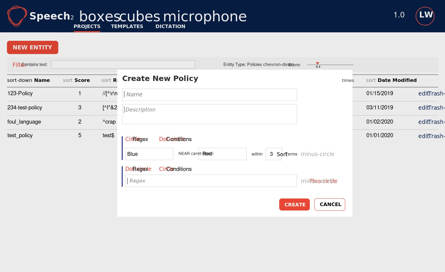
How the work ran
This was intermittent consulting rather than a staff role. The pattern was consistent: the team had a requirement or an idea, and needed it made concrete enough to argue about. I would turn it into wireframes quickly, we would react to those, and it would iterate. The search screen alone went through eight named versions.
Outcome
Speech² was in active development throughout the period I worked on it, and the screens here are the versions the team designed and built from.
This was intermittent consulting rather than a staff role, so my involvement ended at each handover. I can account for the decisions and the reasoning, not for what the product became afterwards.
Published with the client's permission. Sample content shown is placeholder data.
04
Scoring, appeals and the rule that sends you to zero
A quality-management tool where evaluators score agent calls against forms, and agents can appeal the result.
The rule that shaped everything
Evaluation forms are scored out of a hundred across categories such as greetings and service types. But some questions are regulatory. If an agent misses one of those, the entire evaluation drops to zero, even if they scored ninety-nine everywhere else. That is not a bug in the scoring. It is the signal to a supervisor that the agent needs coaching immediately.
Designing for that rule is the whole problem. A score of zero next to a form full of ticks looks like a system error unless the interface explains itself. The scoring has to feel deliberate and fair at the moment it delivers the worst possible outcome, to a person who is about to appeal it.
Priorities, in the order I set them
- Transcript, call and playback. The evidence comes first. An evaluator cannot score what they cannot hear.
- The form. Question categories, radio, dropdown and free-text answers, points attributed to the agent, notes.
- The review queue. Batches of calls to work through, with randomiser logic so evaluation is not cherry-picked.
- Appeals. Last, because it is the least frequent and the most sensitive.
The appeals chain
Agents do not have access to the analytics system. A supervisor appeals on their behalf. A judge then reviews the appeal and rules one of four ways: the mark stands, it is overturned, it is a draw, or it is discarded. Every one of those outcomes needed to be visible on the evaluation itself, because the record has to survive scrutiny long after everyone has forgotten the call.
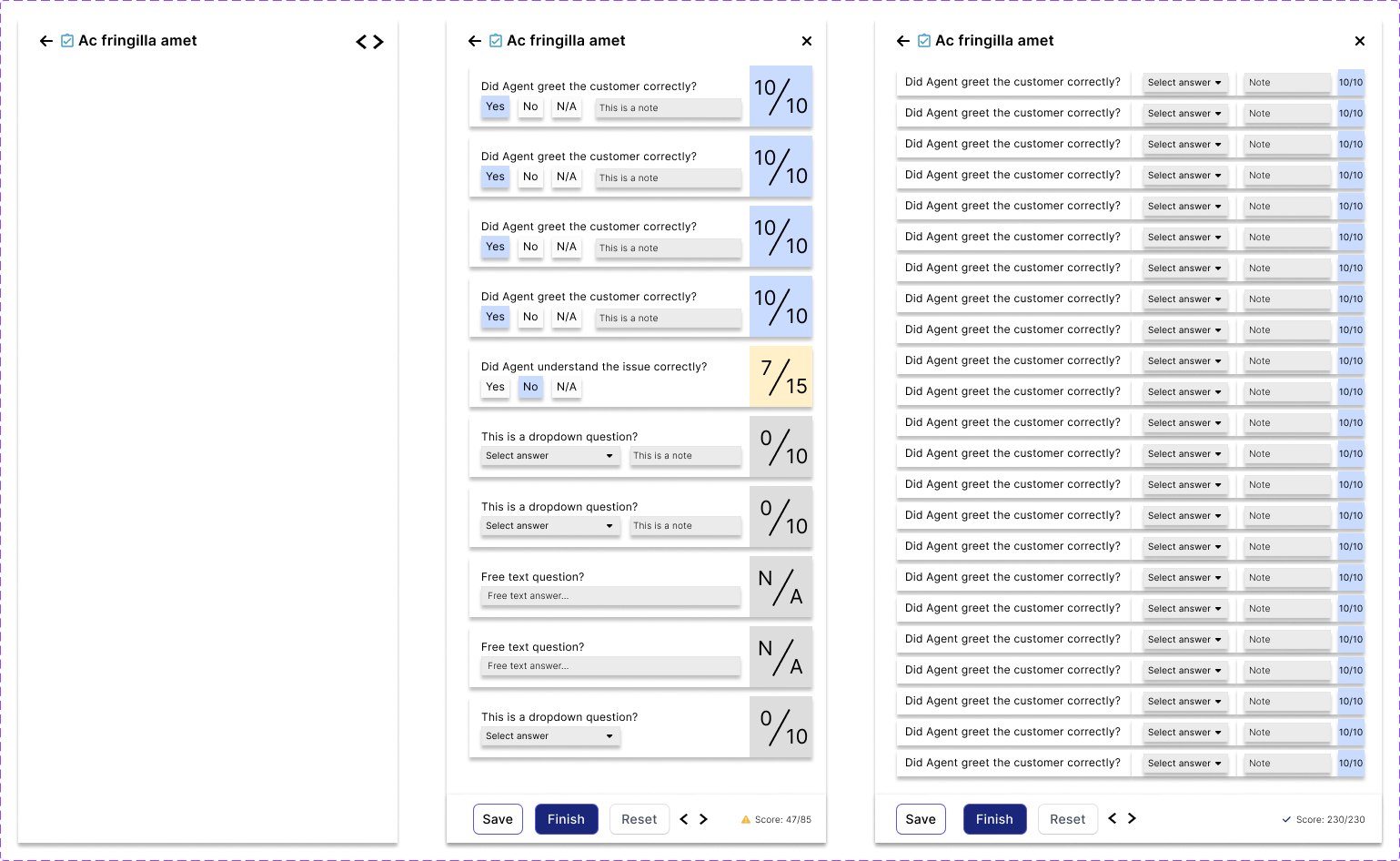
Built as a system, not screens
The evaluation cards were built as a Figma component set with variants for default, low score, dropdown answer, free text, with notes, and dropdown with notes. The form itself had list, form and table-form variants. Eight iterations from v1.1 to v2.3.
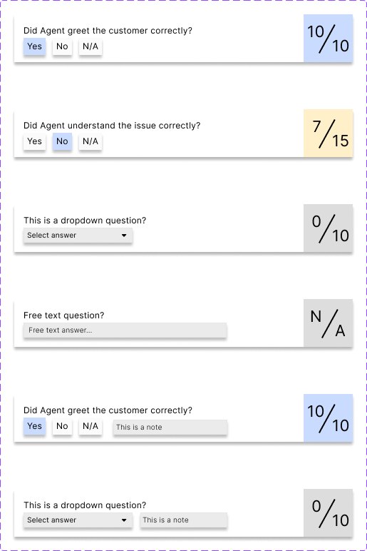
Published with the client's permission. Sample content shown is placeholder data.
05
Replacing a tool people had given up on
Designing the successor to Autonomy Business Console, search augmentation for HPE IDOL, while still employed as an engineer.
Context
IDOL was HPE's machine-learning platform for unstructured data: text, speech, audio, image and video. Enterprise search was one of its main selling points. Search augmentation is the work of making that search return the right things: promoting particular documents for particular queries, managing synonyms and blacklisted terms, and understanding why a query returned what it did.
The existing tool for this, Autonomy Business Console, was slow, dated against modern web applications, and had a steep enough learning curve to be a barrier in itself.
The problem, and the research I could actually do
The users were not the people searching. They were business and content administrators tuning search on behalf of everyone else: a group with deep domain knowledge and no patience for a tool that made them work to express it.
I could not talk to them directly. What I had was the predecessor product's customer feedback, market research, customer-proxy requirements from the sales side, and the ability to study the old tool closely. So I built the understanding from those instead, and wrote it down as personas and user stories the whole team could design against.
Working without direct research access is the normal condition in enterprise software, and being effective anyway is a skill rather than an excuse. The evidence is there if you are willing to go and find it in support tickets and sales calls rather than waiting for a research budget.
What I designed
- Promotions. Showing chosen documents for queries matching specified criteria, built as a progressive-disclosure wizard because the rule being defined has genuinely many parts and a single form would have been a wall.
- Keyword management. Synonyms and blacklisted terms, added through a stepped flow that asks for the keyword type first, because the two behave differently and choosing up front removes an entire class of mistake.
- Test search. Run a query and see the augmented result, so an administrator can check the effect of a rule before trusting it.
- Analytics dashboard. Searches over time, popular terms, zero-hit terms, index size distribution. Zero-hit terms are the most actionable thing an administrator can see: the questions people asked that the system had no answer for.
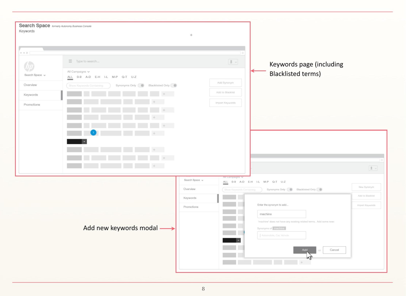
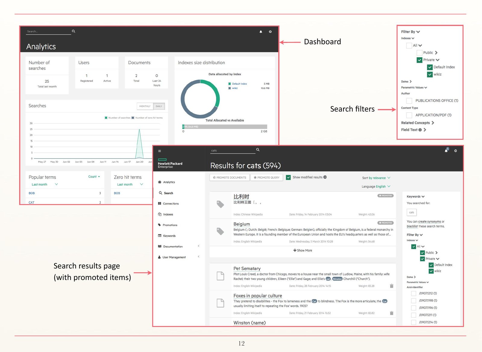
Engineer and designer at the same time
I was employed as a front-end engineer on this team and took on the design work because it needed doing. That shaped the outcome. I knew what was cheap and expensive to build, I could prototype in code rather than describing an interaction, and I was involved in implementing and testing what I had designed. I was later recognised as UX lead on the team.
It also means the constraints I recorded at the time are engineering constraints as much as design ones: framework capability and limitation, developer time, fool-proofing against user error.
Outcome
The Search Augmentation Tool shipped as the successor to Autonomy Business Console and continued to be developed after release. It carried forward into Micro Focus as Search Optimiser.
Screens shown are design mockups populated with placeholder data. No customer data, proprietary assets or confidential documentation are reproduced.
06
Deciding what the machine gets to close on its own
A concept build for AI-assisted compliance QA in a contact centre, and the threshold question underneath it.
Context
Contact-centre quality management used to work by sampling. A supervisor listened to a handful of calls per agent per month and scored them against a form. Speech analytics made it possible to score every call instead, and machine classification made it possible to score them without a person listening at all.
That creates a question the industry has not fully answered. If the system can evaluate a call end to end, how much of that evaluation is allowed to stand without a human ever seeing it, and what happens to the calls where it is unsure.
Why I built it
I spent three years designing agent evaluation and appeals at Soho Squared, before this level of automation was practical. I wanted to work out what the interface looks like once it is, so I built a running concept rather than writing an opinion piece about it.
The threshold problem
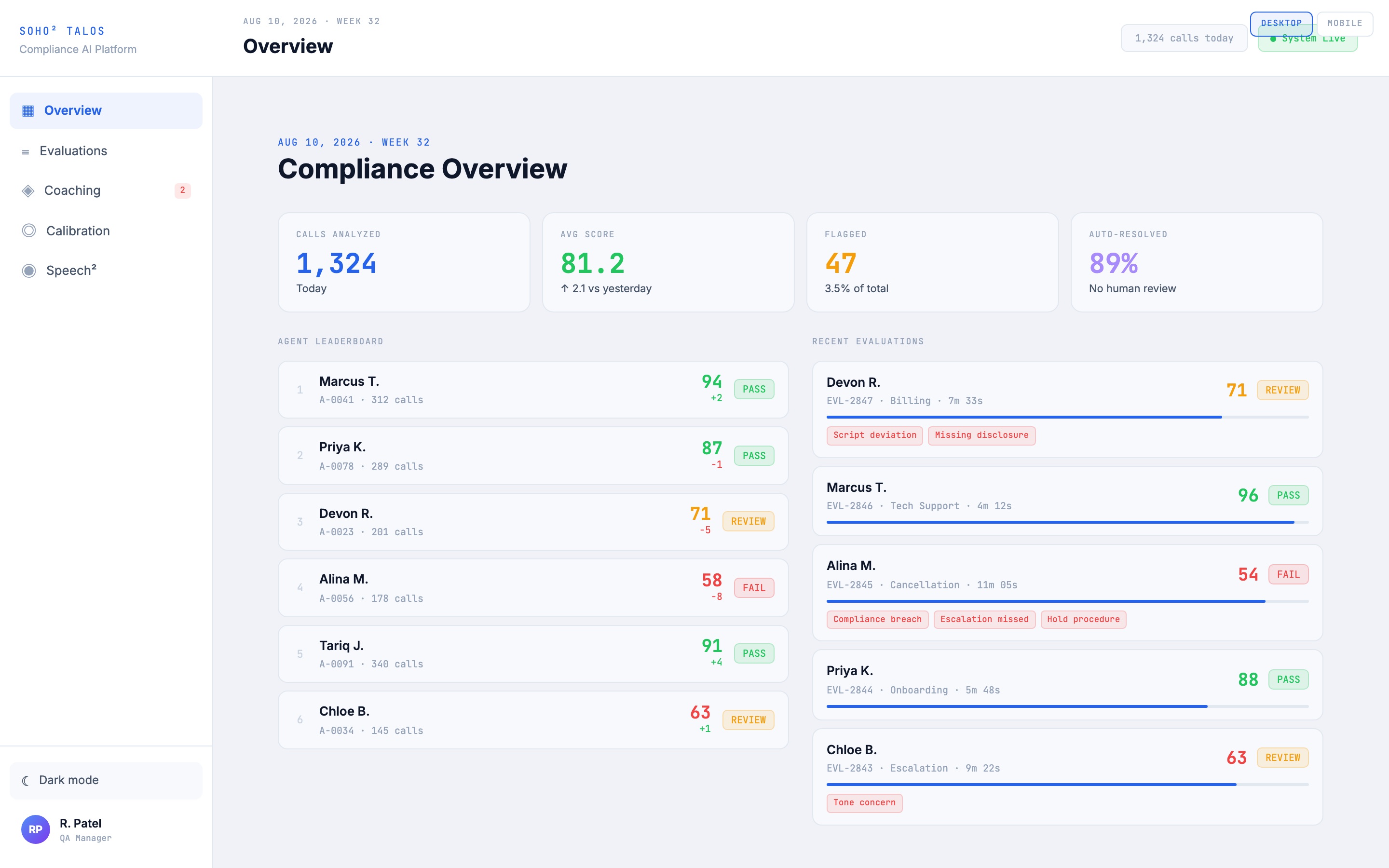
The dashboard leads with four numbers: calls analysed, average score, flagged, and auto-resolved. The fourth one is the interesting one. It reads 89 percent, and underneath it says no human review.
That number is a policy decision wearing the costume of a metric. Push it up and you save supervisor hours, and you also accept that some proportion of wrong evaluations will reach an agent's record with nobody having checked. Push it down and you have rebuilt the sampling problem with extra steps.
The design position I would defend. Auto-resolution should be allowed to pass a call, and never to fail one. A false pass costs you a coaching opportunity. A false fail lands on a person's performance record, affects their pay, and in a regulated setting has to be defensible to a regulator. Those two errors are not symmetrical and the interface should not treat them as if they are.
What the concept covers
- Overview. Volume, average score, flag rate and auto-resolution, plus an agent leaderboard scored pass, review or fail, and a live feed of recent evaluations.
- Evaluations. Individual calls with the specific finding attached: script deviation, missing disclosure, hold procedure skipped, escalation missed, tone concern. Findings are named, not scored into a single opaque number.
- Coaching. Findings routed to a supervisor as an action rather than a report. "FDCPA disclosure omitted on three of the last five calls, immediate coaching required" is a task. A score of 71 is not.
- Calibration. The part most tools leave out. Human evaluators disagree with each other, and if you are going to train a model on their judgments you need to know by how much. Calibration is a first-class section, not a settings page.
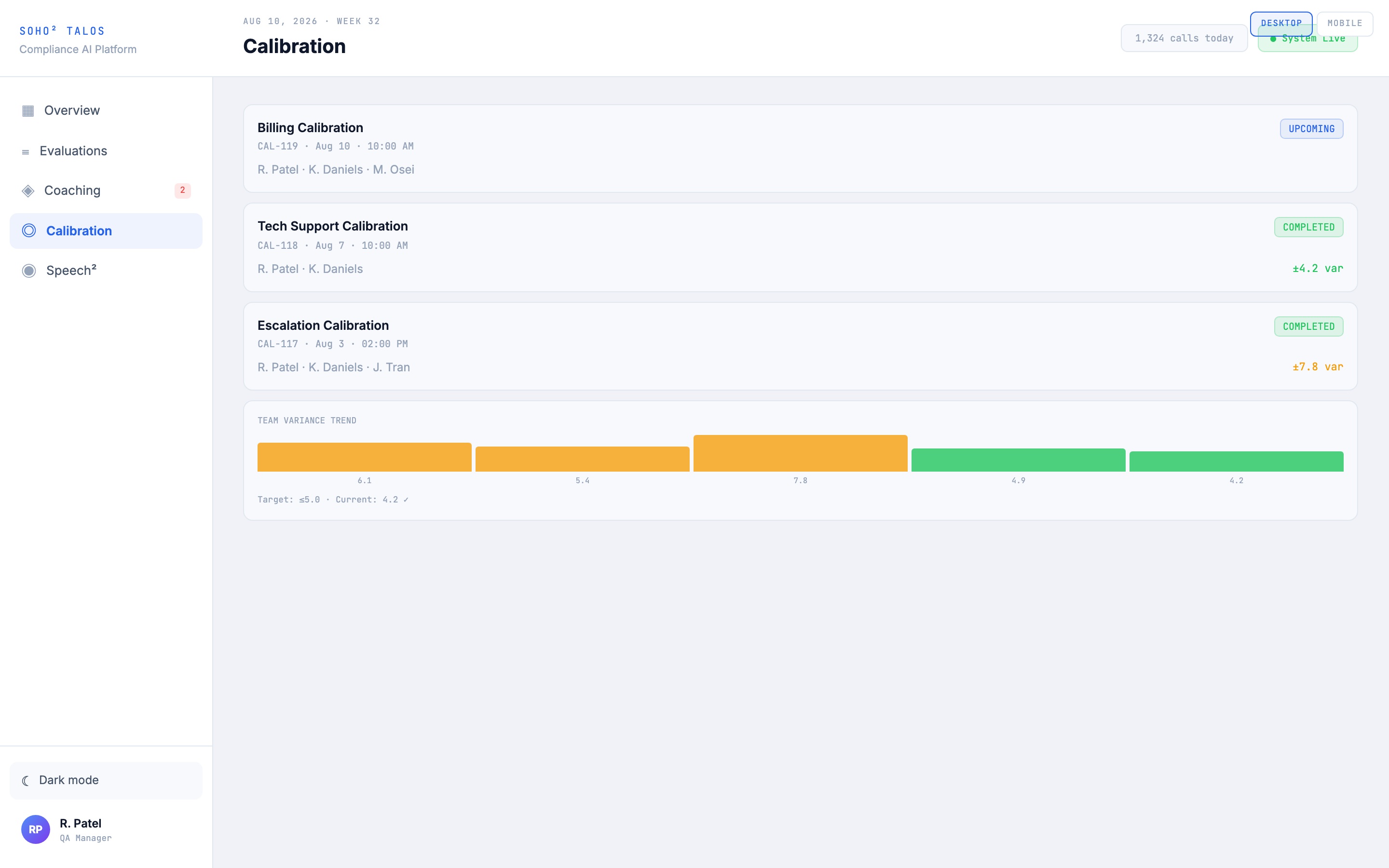
The same system on a phone
The concept carries a desktop and a mobile expression of the same product, and the interesting part was deciding what does not survive the trip. A supervisor at a desk is reviewing and deciding. A supervisor on a phone is between things, and usually looking because something has already gone wrong.
So the mobile build is not the desktop one reflowed. The four summary numbers stack into a two-by-two, the leaderboard drops its detail columns, and the five sections move to a bottom tab bar within thumb reach. What gets kept at full weight is the evaluation state, the AI confidence bar and the named findings, because those are the things you would pick the phone up for. What gets dropped is anything that exists to support a decision you would not make while standing up.
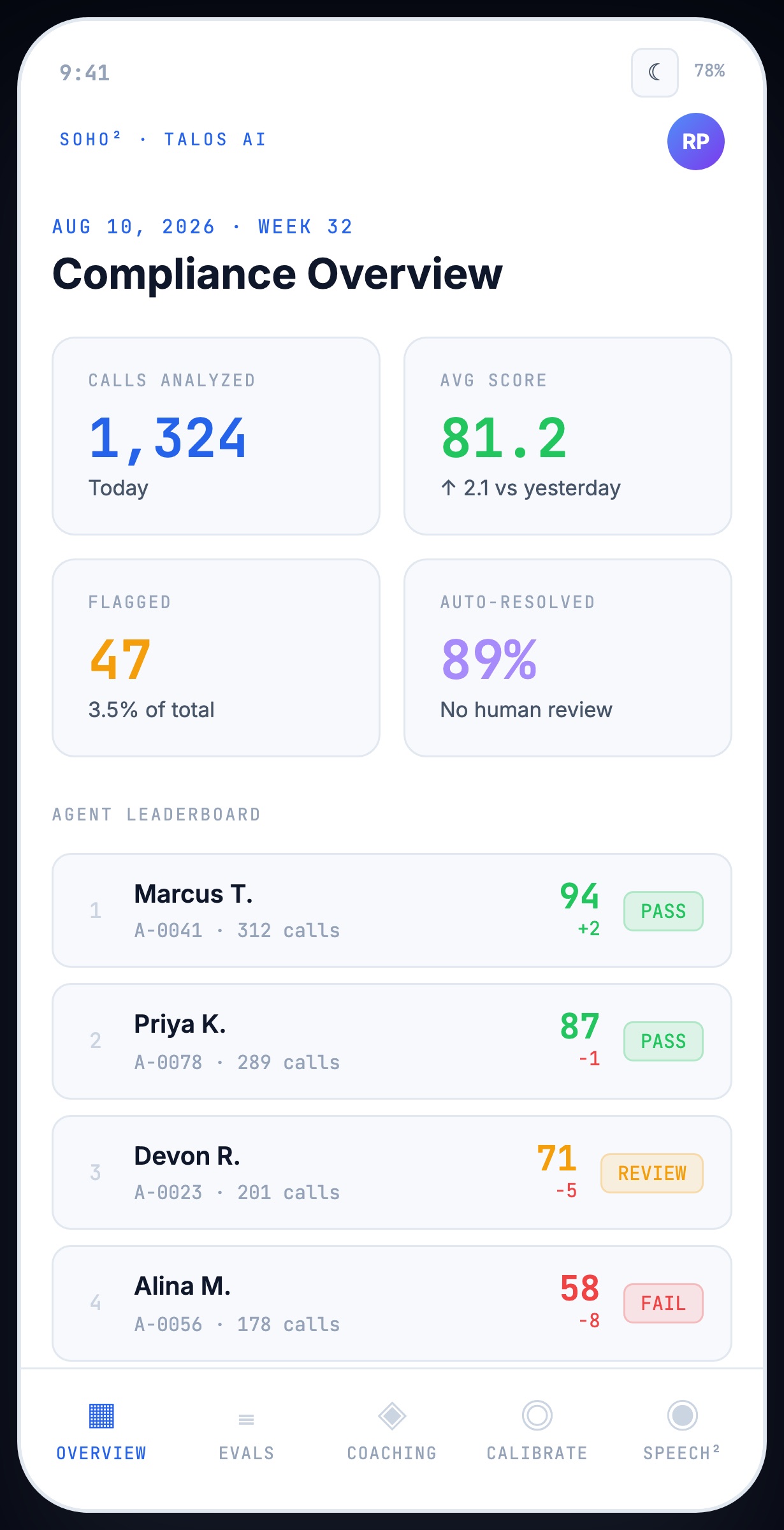
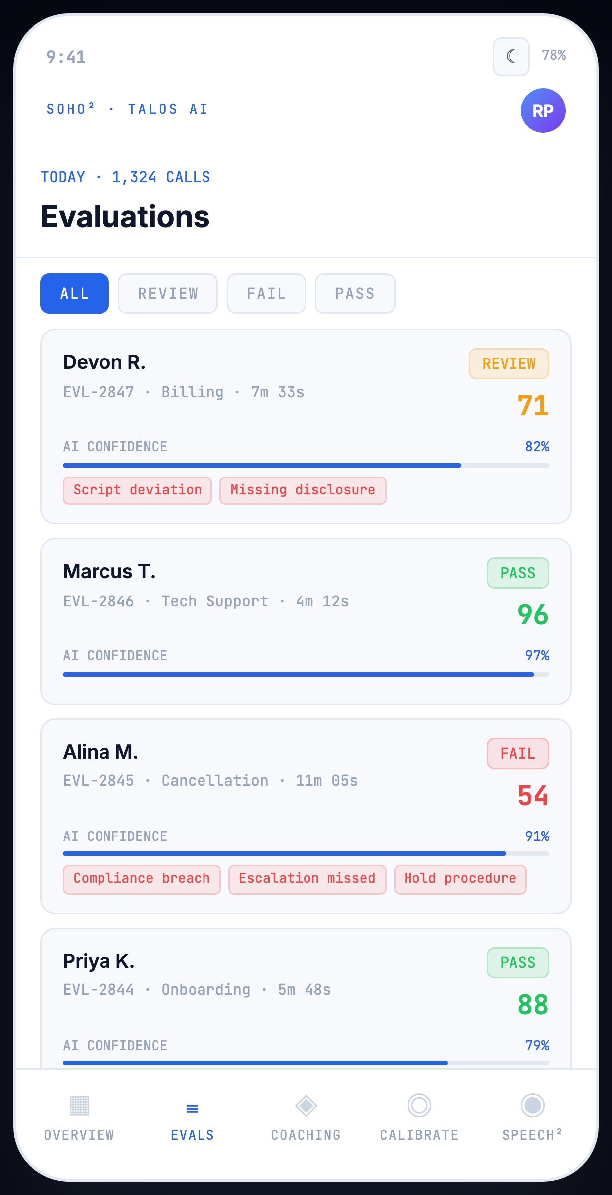
Confidence belongs on the row, not in a detail view. Every evaluation shows what the model scored and how sure it was. A 71 at 82 percent confidence and a 71 at 97 percent confidence are different objects and should be triaged differently, and if you have to open a record to find that out, nobody will.
Agent assist is the one surface here I had designed before, and it is the one that changes most on a phone. It runs live, mid-call, for someone who can spare a glance and not a read — so sentiment is a position on a track rather than a number, the alerts are shape and colour before they are text, and the suggested actions are large enough to hit without looking. That constraint is the same one a consumer app faces on a phone in a hand. It just arrives wearing a headset.
How it was made
Built with AI tooling rather than drawn frame by frame. The domain model is mine, informed by the evaluation and appeals work I did at Soho Squared, and the build is a working front end I directed and corrected rather than a static mockup. I am explicit about this because the method is part of the offer: turning a written requirement into something arguable inside a week is a service I sell, and this is what that looks like.
Self-initiated concept work. Not built for or with any client, and no client data, assets or documentation are reproduced. Names, scores and findings shown are invented.
07
Supporting work
Shorter pieces worth a page rather than a full study, and two 2026 concept builds.
Policy prioritisation, Smarsh
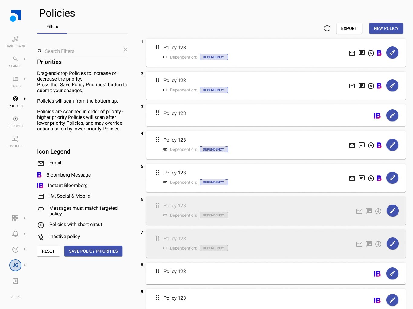
Compliance policies scan communications in a defined order, from the bottom of the list upward, and a higher-priority policy can override the actions of a lower one. Policies can also depend on each other, and some short-circuit the rest of the chain.
That is a hard mental model, and the design carries it: explicit numeric priority, drag-and-drop reordering with a deliberate save step rather than autosave, dependency shown on the policy itself, distinct icons for short-circuit and inactive policies, channel icons with a legend kept permanently visible, and a plain-language explanation of scan order beside the list rather than behind a help link.
The save step is the decision worth defending. Reordering policies changes what gets flagged across an entire organisation. Autosave would be actively dangerous. Making the user commit is the right friction.
Case management and legal hold, Smarsh
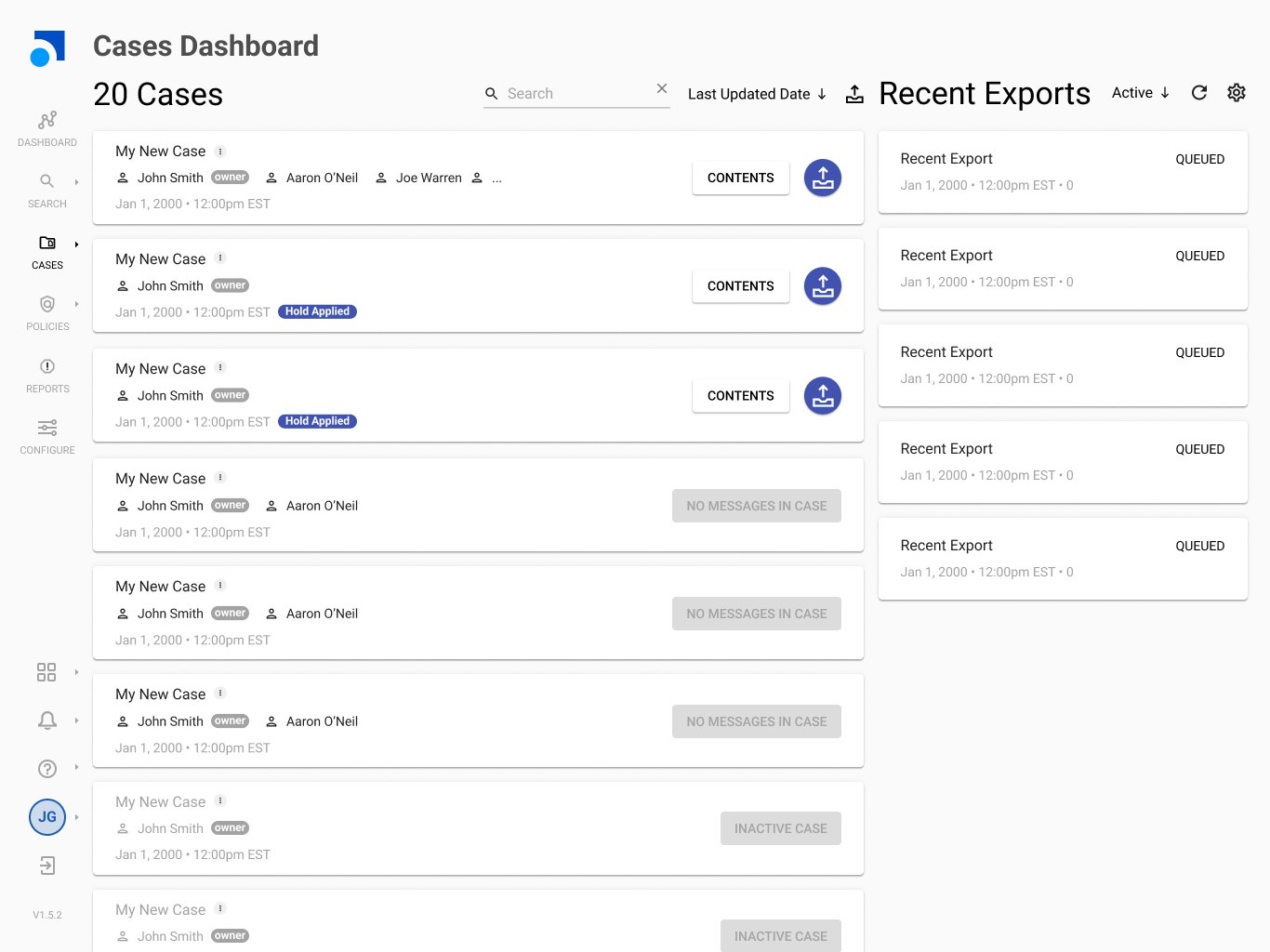
Cases collect messages for investigation or litigation. The design covers creating a case with custodians and date ranges, applying legal hold, case states for active, hold applied, no messages and inactive, and reviewing case contents in table and card views using the same review actions available in search, so reviewers never learn two systems.
Answer Bank triage, HPE IDOL
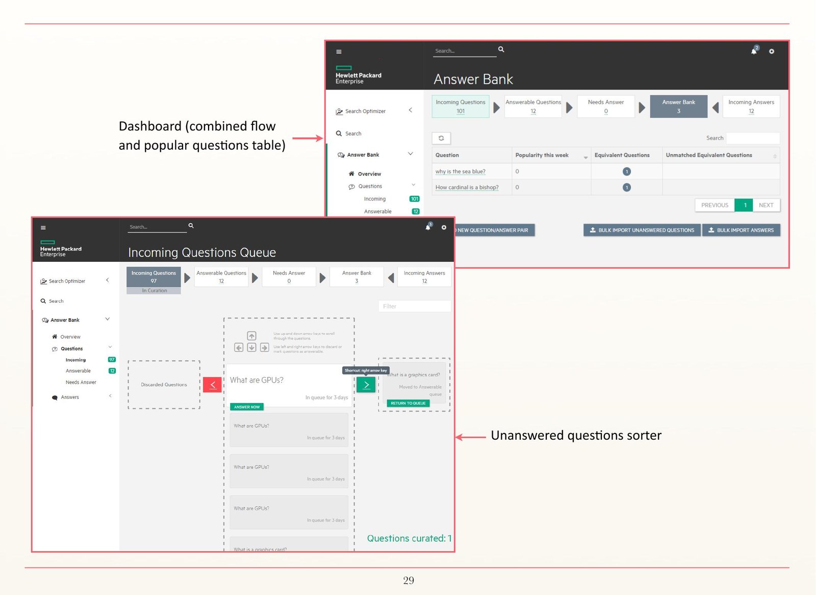
A curation queue for incoming questions needing answers, with a pipeline bar carried across every screen showing where content sits: incoming, answerable, needs answer, in the Answer Bank, incoming answers. Curators triage from a queue, discarding, answering, or linking a question to an equivalent one. The pipeline bar doubles as navigation.
FoundryInk, concept build, 2026
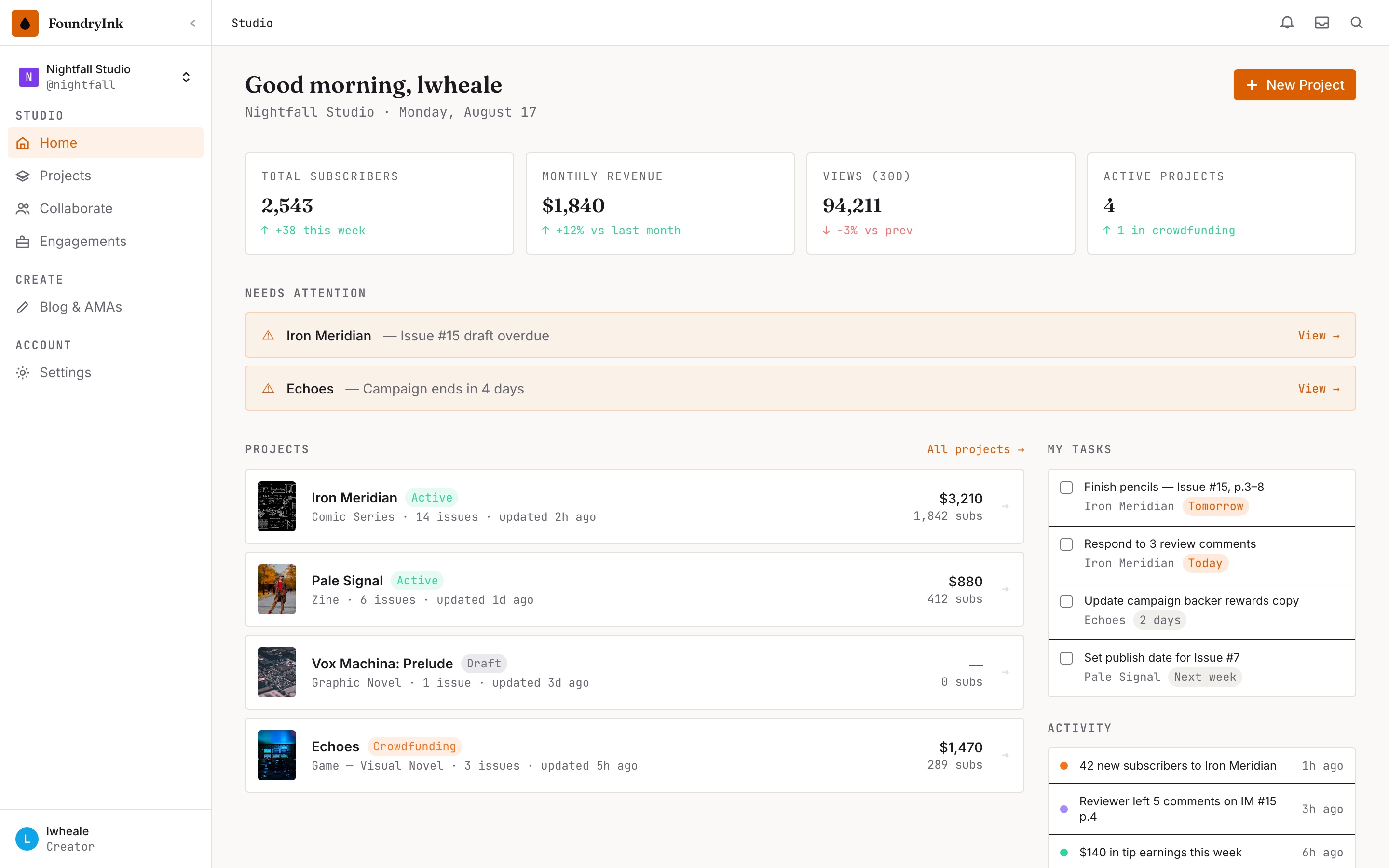
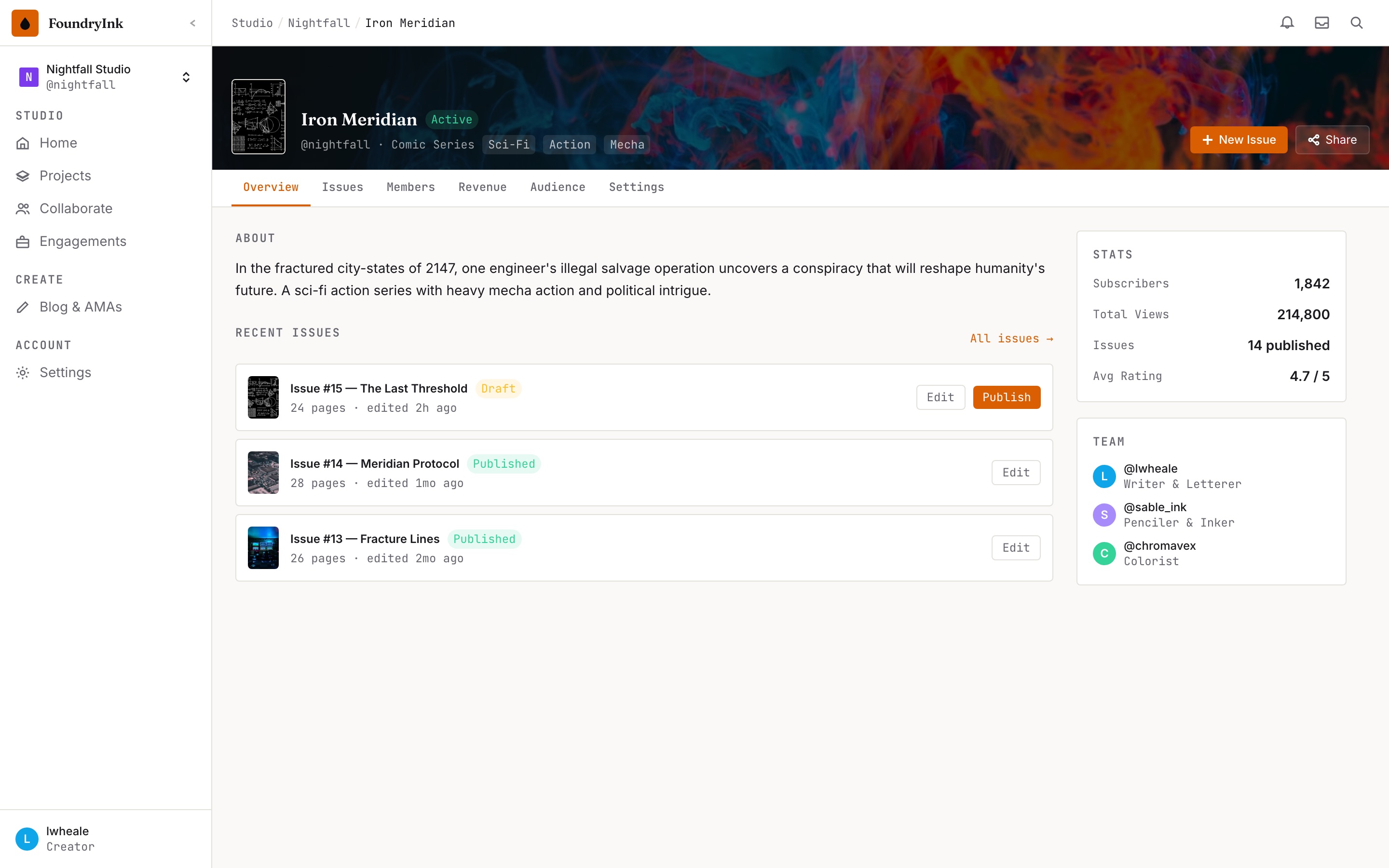
A studio and publishing tool for independent comics creators: projects and issues, collaborators with named roles, revenue and crowdfunding, audience, and a publish flow. It came out of my own contract illustration work, where the production side is handled by a stack of unconnected tools and a spreadsheet.
The design problem is that a creator studio has two audiences inside one product. Making an issue is close work — pages, letters, revisions, a small team with different jobs. Running the studio is portfolio work — which title is earning, which campaign ends this week, what is overdue. I kept those on separate levels rather than one merged dashboard, so the studio home answers what needs me today and the project answers what is this thing. The home screen leads with what is wrong, not with what exists.
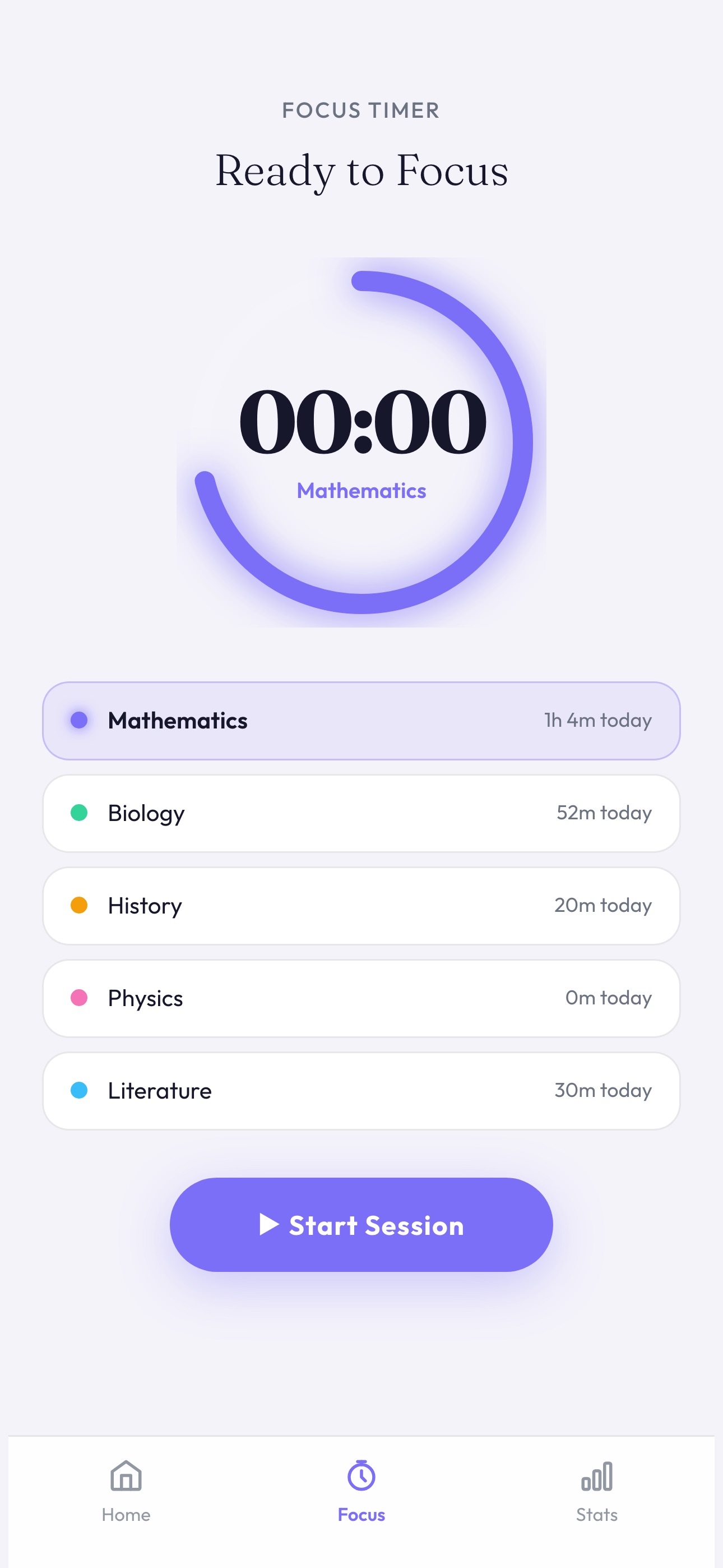
Study tracker, concept build, 2026
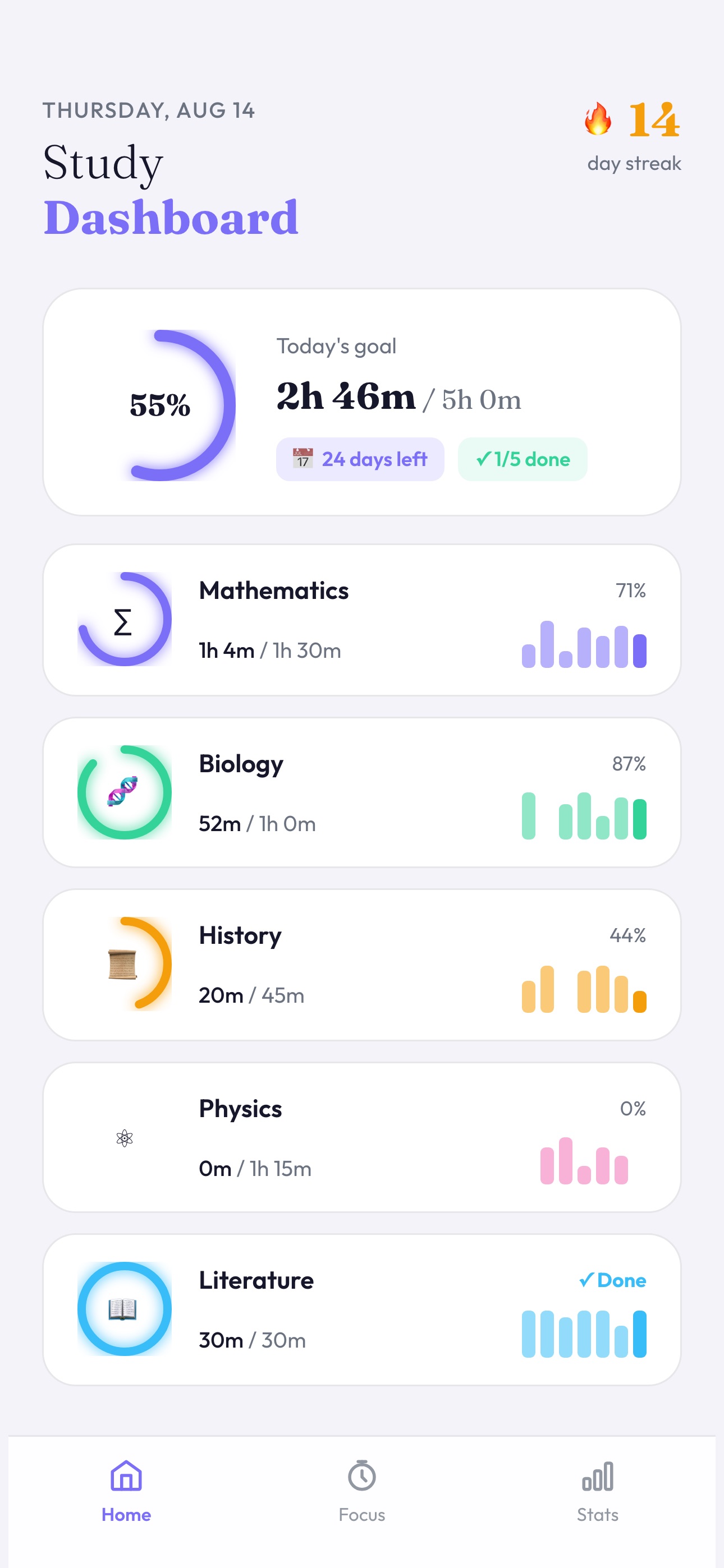
A mobile-native habit tracker for exam revision. I built it deliberately as the opposite of the work I usually do: nobody has to open it, nothing bad happens if they close it, and the entire design problem is motivation rather than information.
Which makes it an exercise in the mechanics that actually drive that — a streak count, a daily goal shown as proportion completed rather than time elapsed, per-subject rings, and a focus timer that commits you to one subject before it starts. The honest tension is that every one of those devices can tip from encouraging into punishing, and a streak in particular punishes exactly the person who most needs to come back after missing a day.
FoundryInk and the study tracker are self-initiated concept builds, not client work. Content shown is invented.